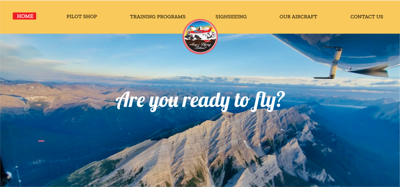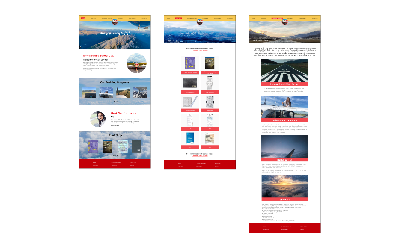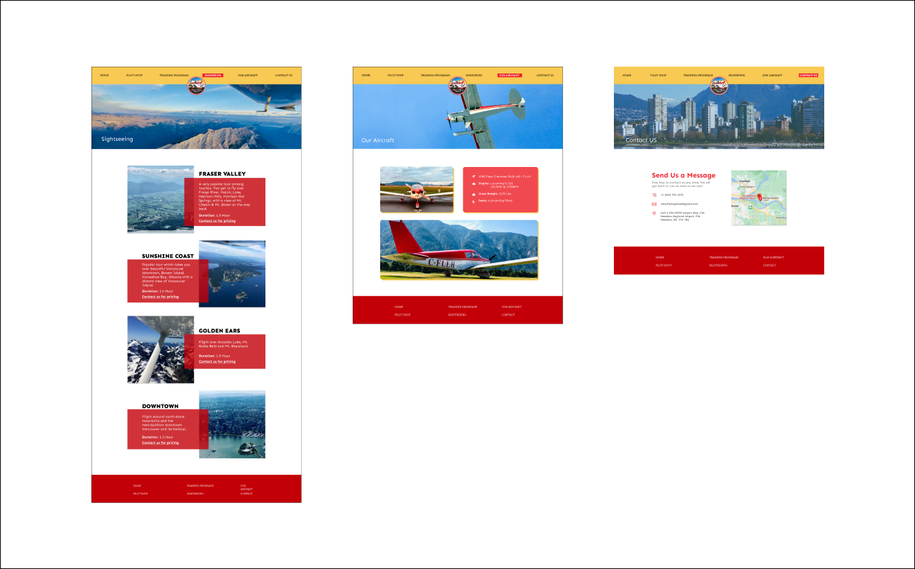
Created a responsive website for our first Client as a team project. Made a question sheet to understand the client's concept of the website. Created wireframe and chose three colors according to the client's hearing. Designed several prototypes for each page and got feedback from the client as things progressed. Also, I tried to respond quickly in order to build reliability. When the designs seemed a little strange, we created another Prototype and got feedback. After explaining about domain and server and put website. Finally, we got praise from the client.
・Flying training school for pilots.
・Targeting the pilot.
・Based in Vancouver.
・Didn't have a website yet.
Main three colors.
・Red: Based on the company logo and client loves red the most.
・Yellow: To bring out the brightness of the website in good combination with red.
・Blue: To make it easier to associate with airplanes or the sky.


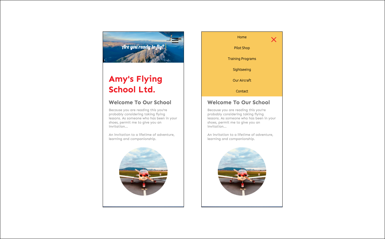
There are a lot of menus, so we put a hamburger menu on this responsive website.
As with the desktop menu, the background color is yellow, and when you hover the cursor over it, it turns red.

・The client was unclear about what kind of website wanted us to create, so it was difficult to find the one that fits this company and the client's desire. But I focused on searching for the desire while hearing from the client and finally we created what the client wanted. To start the project, I felt it is really important to do a hearing and reach the client's desire.
・By explaining the server contract from domain acquisition, I was able to know the process of hosting service.
・I met a wonderful opportunity this time and felt a sense of accomplishment in this website that we created for client for the first time.
・I strongly want to continue to focus on hearing and provide designs that would please clients.