As a school project, I created a design concept for a coffee shop, which needs a website to create a new channel to promote their products, services and increase customer engagement. The new website will help their clients search and buy products online.
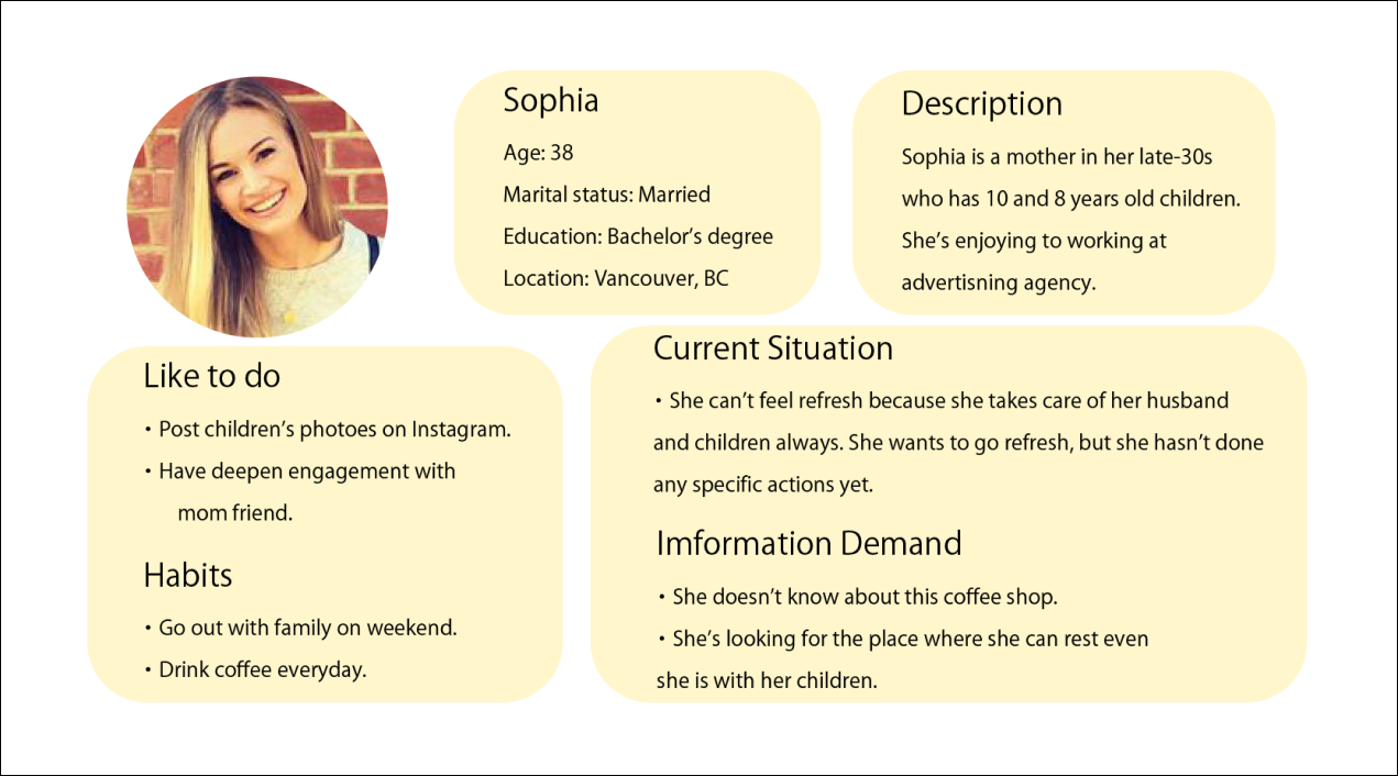
Coffee Shop Website・Targeting the Family.
・A small coffee shop located in Surrey in Vancouver.
・Loved long by local people, especially for attractive Latte art.
・Also, they provide some latte art lessons in store.
・They don't have an online channel yet.
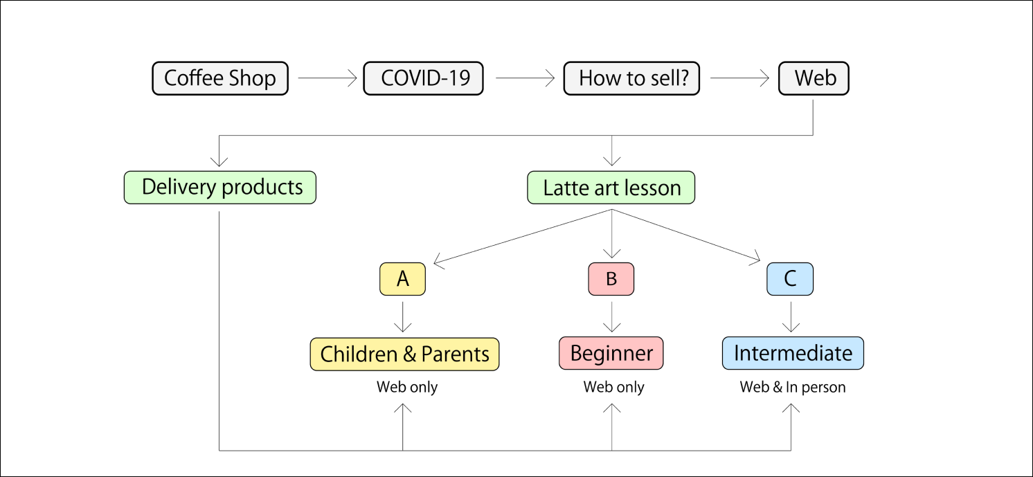
・The customers are decreasing because of COVID-19.
・They know this area is expected for increasing the population dramatically but they don't know how to promote this business chance widely.
・The number of IT companies will increase in near future in great Vancouver.
・Large-scale redevelopment will proceed in various areas.
・There are fewer Latte art lessons in the coffee shop in Vancouver.
Create a website for two purposes.
① Sell products online such as coffee beans, cups, and equipment for Latte art lessons.
② Provide Latte art lessons online in great Vancouver.
→They can increase not only local customers but also online users in great Vancouver.
Divided into three types for users. One, for children and parents. Second, for beginners. Third, for intermediate.
Also, the user who wants equipment for latte art lessons can purchase the product online.
Targeted the Family in their 30s to 40s especially mothers. They are expected word of mouse effect from mom friends.
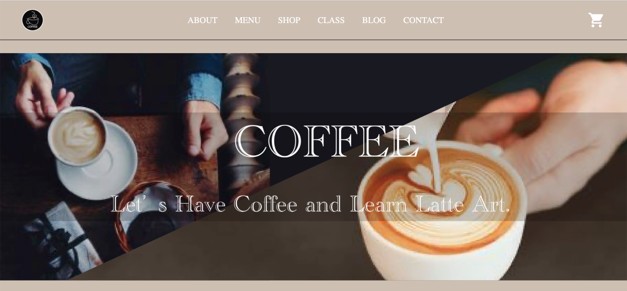
・Four main colors to be simple and easy to see. The typical image of coffee would be black but I thought it'll be too much luxury and far from the target Family this time. So I change lightened the black color provided calm feeling, expressed easy to imagine coffee likeness.
・Since yellow is the bright and friendly color, I chose this for the target.
Keywords..
Dark brown: Coffee #312620
Yellow: Friendly, Family, Active #F7E79F
Light beige: Cozy, Comfortable #CCBEB0
Gray: Elegant #565857
・Not too much luxury
・Yellow for parents and children
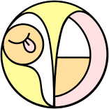
・Created two types of Logo, black and white, look simple and rememberable.
・Based the design on the coffee cup kindly and friendly handwritten style. So that user who see this Logo for the first time can recognize it faster.
・If you move your cursor on Logo, the Black Logo will change to a white Logo.
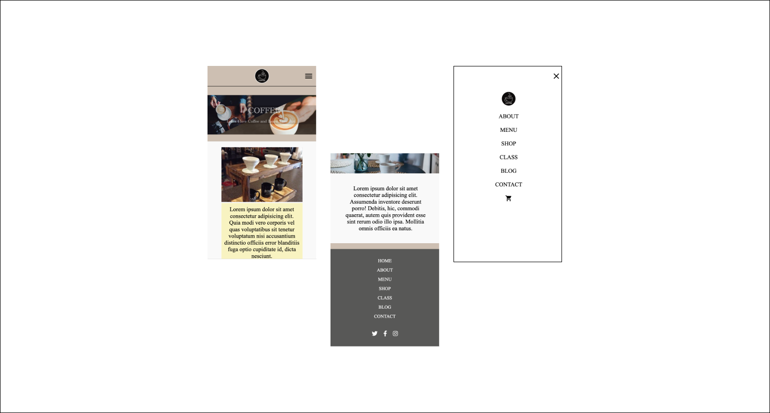
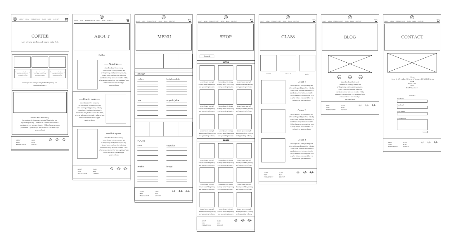
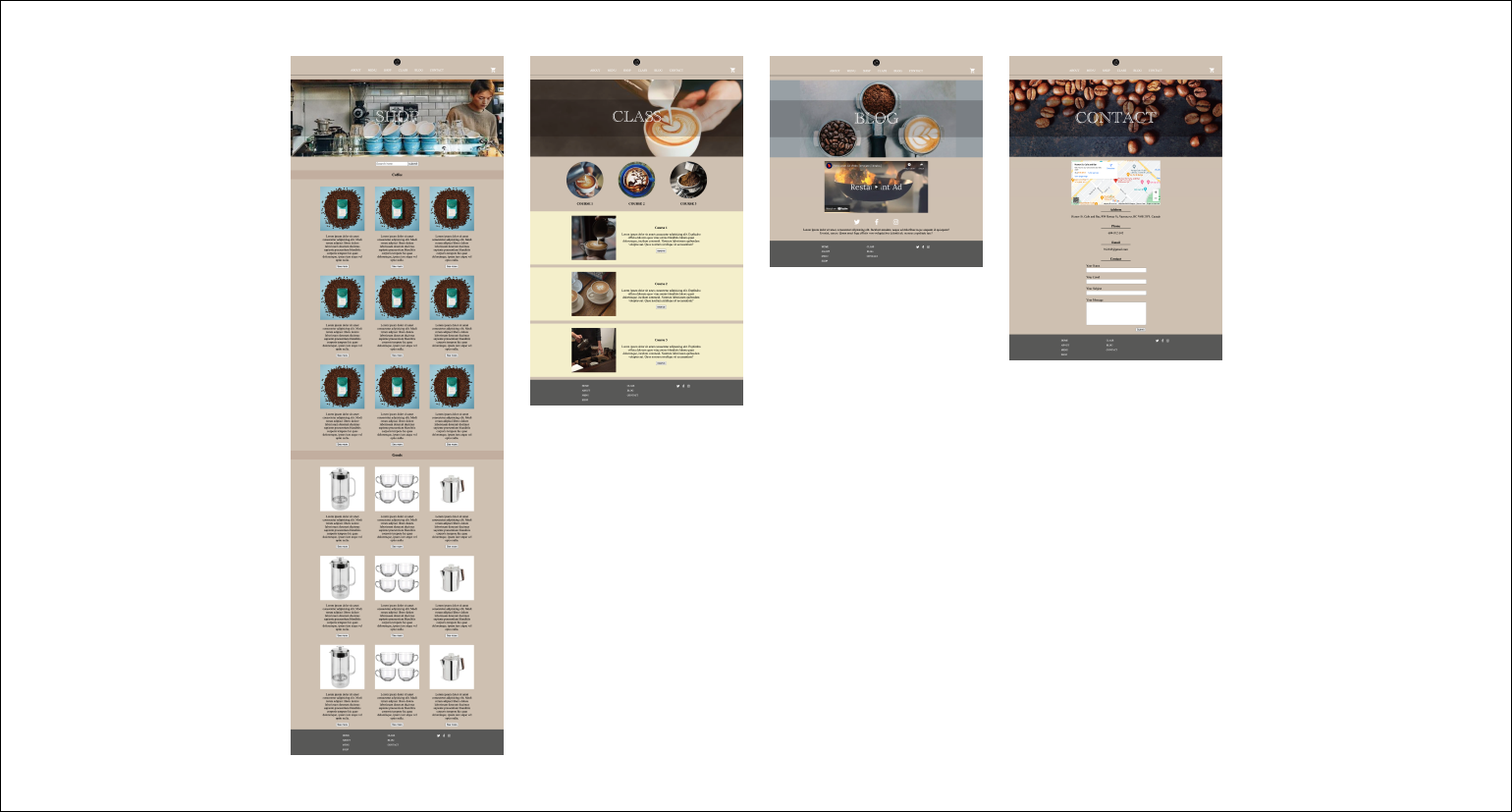
・Created the 7 wireframes.
・Put the same size photo at the beginning of each page.
・Placed the Logo in the middle except for the landing page for made it possible to understand easily, which is the main screen.
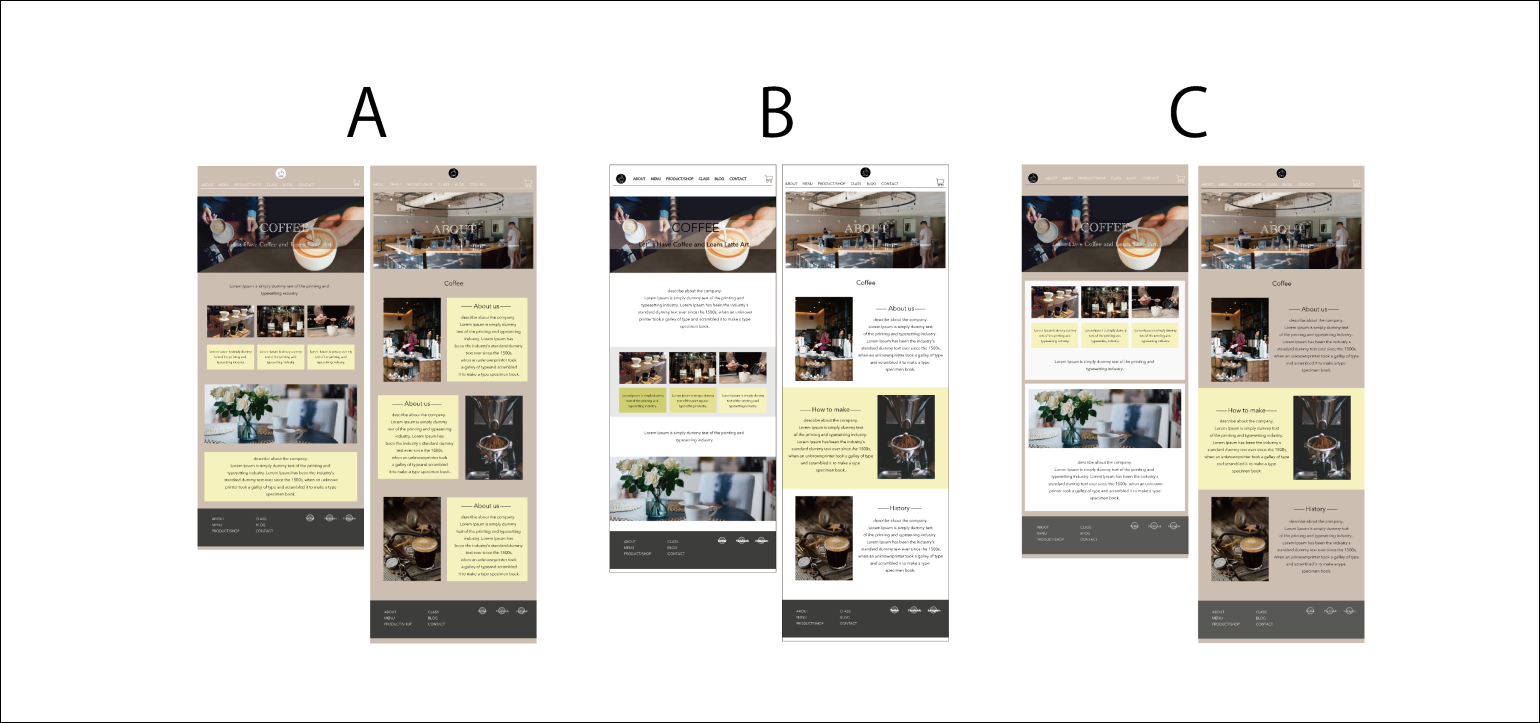
Made three different designs at the first.
・A, beige background color and put yellow to paragraph but it's not a good color balance.
・B, white background color. it's bright and easy to see but, the brand image of the coffee shop wouldn't be transmitted.
・C, based on A and B. colored beige on the background and add white widely. Considering the balance between brand image and visibility.
・Since yellow is family color, I used yellow widely. Especially on the Menu and Lesson page.
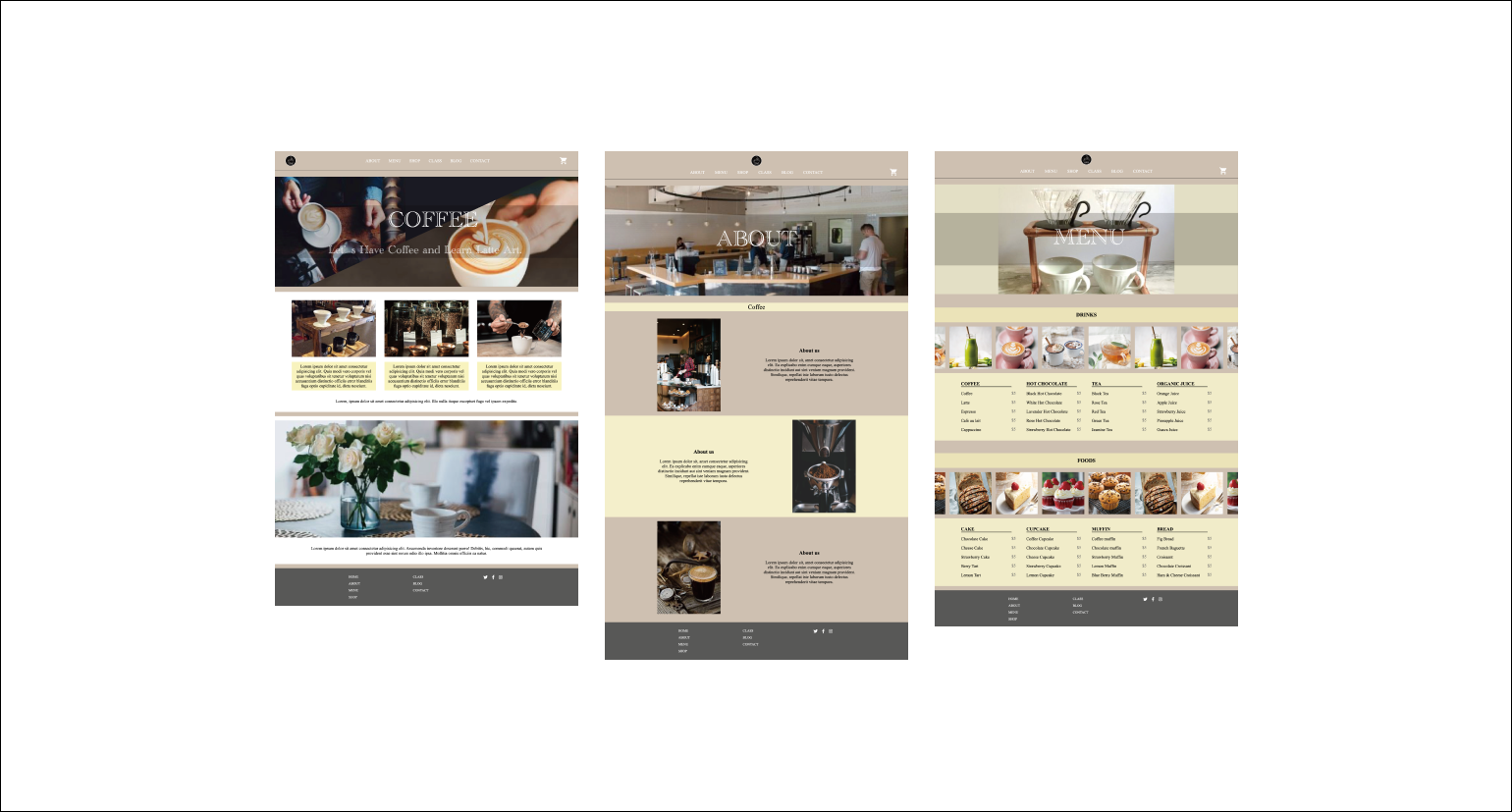
・In the Shop, Blog and contact page, I used light-beige simply instead of yellow for balance.
Created the responsible design. Arranged the photo to added the hamburger menu to make it simple.